Big Ant Studios
  • Home
  • Grasses
    • Polychrome Monoprints
    • Elymus
    • Chasmanthium
    • Avena
    • Rushes / Equisetum
    • Leaves
    • Sedges
  • Collagraphs
  • Stamp Replicas
  • Melville
  • Arcadia
  • Photos
  • Blog
  • Contact

Block Prints

3/22/2023

0 Comments

 
Picture
Block prints are made by pressing paper against the flat of a block in which a design has been excised with carving tools. The flat surface is first covered with ink the consistency of toothpaste, usually by means of a roller.  Where the paper touches the flat areas that remain after the carving is completed, the ink is drawn onto the paper, reproducing the design that has been carved. This act of pulling the print reverses the original design, that is, the print and the block are mirror images.
Picture
My block prints are cut into a matrix of linoleum, a material that is easy to carve and holds up to making multiple prints. The concept of multiples is a source of some confusion to beginning art collectors. A painting is an original, and if a copy is made, that copy is a reproduction. Quality reproductions can be made by various means, but there is still only a single original in painting. In printmaking, if the same logic is followed, the block itself would be the original, but this is in reverse, so the block itself is not very collectible. The product in printmaking is the print, and these are numbered into an edition. In a limited edition print, there are normally not more than a hundred prints, and each one is an original. Since there are multiple originals, they must be made as close to identical as possible, within the limits of printmaking art. Reproductions, on the other hand, are produced by machine, so they are exact copies, not originals.

My linoleum block prints are very finely detailed, and this level of precise cutting is accomplished because I work under a stereo dissecting microscope. This process requires some delicate skills which I honed with years of working under the microscope as a biologist. I worked with Drosophila melanogaster, the fruit fly barely a couple of millimeters in length. The various strains of interest are distinguished by minute differences of many traits, such as eye color, forms of the small body bristles, changes in the pattern of the wing veins, and many other tiny variations. The skill of working under the microscope with small organisms transferred to cutting on blocks with small cutting tools, so I am able to produce fine blocks that would be a great challenge to most artists.

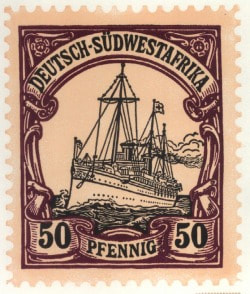
My first prints were linoleum block print replicas of  classic postage stamps. Later I began to produce prints with more original designs. .
0 Comments

Corridor

3/22/2023

0 Comments

 
Picture
Picture
How many times did I amble down this "back alley" to my apartment? Twenty five years is 9125 days, and I surely passed along this sidewalk at least once a day. Now only the untethered leaning telephone pole and ancient oak remain, my former home, ... gone. The maintenance shed whose roof my bedroom looked out onto. ... gone. Even the sidewalk, ... gone. My life at Wilshire Village, ... gone.
0 Comments

Shelley

3/22/2023

0 Comments

 
Picture
​I had been volunteering at the Museum of Printing History for more than a year, accumulating studio time to work on book arts projects. I was finally ready to to set my first type, and wanted to start with a modest project. A single page of text would he a good beginning, and a succinct and meaningful poem would be ideal. All the past fall I had I had been watching episodes of Inspector Morse and its successor, Inspector Lewis, on PBS Masterpiece Theater, as much for the wonderful poetry by A. E. Housman and others as for the drama of the series. The action takes place at Oxford University where multiple murders must be solved without disturbing the dreamy academics. In the episode "And the moonbeams kiss the Sea," Percy Bysshe Shelley's poem, Love's Philosophy is found in the pocket of a murdered art student. An early suspect is another artist with a quirky personality, perhaps somewhat autistic. He seems unaffected by the murder of his friend and lover, is amused that the police have found a "body in the Bodleian," the ancient library at Oxford holding manuscripts of English poets back to Shakespeare and Chaucer. Oxford is the university of my fantasies, and any drama set there is sure to charm me.

For weeks after seeing the episode my mind was full of the Romance of Shelley's life and early death, his passionate loves and committed atheism. The end of the episode finds Inspector Lewis at the Shelly Memorial on the Oxford campus marveling at the icy cool sculpture of the drowned Shelley by Edward Onslow Ford. My first project would be the love poem of Shelley's youth.


The first decision was to choose an appropriate font. I wanted it to be from the times when the poem was published in 1819, but that was not the only restriction. It also had to be present in three sizes: title, body text and present in the museum's collection in sufficient quantity to account for all the letters. The font called Baskerville was a classic early 19th century font that filled the historical requirements, and there was enough of the 11, 12 and 14 point foundry type letters to accommodate the poem.

The second decision was the choice of paper. A machine-made paper would not be distinguishable from a printout from a computer printer. I chose instead a handmade paper made of abaca fibers by the papermaker at the museum, Kathy Gurwell.The paper was a soft paper with a lot of individual variation, and was a lovely shade of beige. Every sheet bore a deckled edge, and the size of 8.5" x 11" left a generous amount of paper surrounding the poem.

The third choice was which press to use, one of the Kelsey platen presses, the Washington press, or the Vandercook proof press. The Kelsey is self-inking, so it would be faster to print a large number, but I only needed 25 copies and did not mind hand inking. The Washington is a little harder to register each sheet, and requires more muscular effort per sheet, so I chose the Vandercook. Each sheet is fed into the press with a rolling motion, so the work flow is smooth, and the hand inking would not be a chore for twenty five copies.

The fourth choice is ink, and the alternatives are rubber-based offset ink and oil based printing ink. Though rubber-based ink is slower to dry, it stores on the shelf longer for intermittent printers like myself. I normally use rubber-based ink for my linocut prints, so I stayed with that.

Foundry type is stored in drawers (cases) filed with a California case layout. I opened the case and with the compositor's stick in my left hand, placed the letters upside down (nick up) into the stick in the order of the text. After each line I checked the tension by adding thins, combinations of brass (2 points) or coppers (1 point) until the letters no longer had any slack nor were too rigid. Setting the entire poem was an afternoon's work. When the lines are turned right-side up, it reads backwards, as it must to print the correct direction.

The following day I arrived early with my paper, ink, roller and cleanup materials in hand. Printing was almost anti-climactic, and in just an hour or so I had all the copies I wanted. These went onto the drying rack, and when I returned the following day the copies were thoroughly dry, and I redistributed the type back into its proper cases.
0 Comments

Bookbinding

3/22/2023

0 Comments

 
Picture

   I consider myself a serious reader, and have read most of the landmark volumes of world literature and philosophy. Like most of my generation, however, I have been a victim of the paperback revolution. Since most of what I have read are paperback versions, I have had little exposure to books as objects d'art. I have taken books for granted, evaluating them solely on their verbal and/or visual content, only occasionally taking note of any other aspect of their design, materials, or production. This began to change one summer session when I was a physics undergraduate. Bored (or perhaps overly challenged) with the tedium of electromagnetic theory, I amused myself by reading Victor Hugo's Les Miserables. The lengthy novel overtook my life, and soon I was skipping classes to stay in my dormitory and read.  The books themselves were from a limited edition of small volumes published in 1894 by G. Barrie in Philadelphia, containing many fine hand-pulled etchings tipped into the volumes at frequent intervals. I became so diverted from physics that I abandoned LeGendre's polynomial, the equation explaining an electrical charge on a sphere, in favor of Jean Valjean and his beloved Cosette, Inspector Javert, and most intriguing to me, the old revolutionary, G----. That summer I flunked out of physics and changed my major to English. I began to seek out hardbound books, spurning paperbacks whenever I had the option.
   My love affair with books began in earnest. but I was still not a very savvy critic. I loved the feel of a good book, the heft of a thick volume in my hand, the feel of good paper, the way the pages turned. I hardly noticed the details of book manufacture. I admired marbled endpapers, but didn't ask questions about their production, and had no sense that they were made by craftsmen. I never connected the stitches with a human hand pulling a needle through the paper, and presumed that task had been entirely mechanical.
   When I became a printmaker, I started to pay more attention to illustrations as an integral part of book content. I purchased illustrated hardbound books when I could afford them, but still considered books a manufactured object rather than a fine art production. That changed when I began to study bookbinding. At first we constructed books without content as straightforward structures. Soon, however, I began to realized that a book could be constructed entirely by hand from its raw materials: bookboard, thread, cloth, paper, glue. New horizons of creative possibilities opened up to me.

A Guide to the Arabic Alphabet
A Pilgrimage to Melville's Manhattan
Two in Arcadia
0 Comments

Printing on a Van der Cook Press

3/22/2023

0 Comments

 
Picture
​When my daughter announced that she was getting married, I was elated. Her intended is a fine man who cares about her and is dedicated to his daughter. I will be pleased to have him for a son-in-law. After the news sunk in, I wondered how I could help with the plans. Fathers of young brides have historically been tapped to pay for the event, but in the modern era of self-reliant women who often marry only after establishing themselves, this practice is often set aside. In any case my monastic lifestyle rules out a significant role in the financial aspect of the celebration. But I wanted to contribute in some way, and I soon realized that I could lessen the burden by printing the wedding invitation as a letterpress project. I was delighted when she agreed that I could take on this task. 

I have been a printmaker since 1998, and have been volunteering at the Museum of Printing History since my exhibition there in 2008. My first letterpress printing there was a poem by Shelley done in December 2010, and I was anxious to extend my experience at the art of text and foundry type. We consulted back and forth on the text of the invitation, the paper, and the font and after six weeks of communiques I was ready to set the form. We had picked Liberty Script, a fine font which the Museum had in abundance in 14 point and 12 point, the sizes I needed for a line length of 20 points. At 72 points per inch, a 20 point line is 3.6 inches. I set the type upside down with the nick up in a compositor's stick held in my left hand as I pulled the type from the case with my right hand. Thus, when the stick is turned upside down, the text reads backwards as it must for printing from lead font. Since the text was to be center justified, I placed an equal number of spacers of whatever sort I needed (quads, em-spaces, en-spaces, etc) on both sides of the text, then adjusted the tension with thins of 1 point (copper) or 2 points (brass) until the tension was just right before moving on to the next line. 

When all the lines were set, I placed the form (the type to be printed) on the bed of the Vandercook press and placed furniture around the text, including horizontal and vertical quoins to tighten the text and prevent slippage during the printing process. I planed the letters by tapping with a rubber mallet to make sure no letter stuck up too high, checked that there was no lateral slack by pushing backwards and forwards, then tightened the quoins to secure the form on the press bed. I inked in red (Pantone 199) with a hand roller, and printed on Fabriano Medioevalis. 
0 Comments

Fan Palm

3/18/2023

0 Comments

 
Picture
Picture
​
 My neighbors, Linh and Kris, tended a lovely garden at the foot of their stairwell for many years. Protected by the canopy of a grand willow oak, the fan palm grew slowly larger as the years accumulated. I often admired its graceful curves, never more than on one foggy morning just before tenants at Wilshire Village were evicted and the complex abandoned. Returning a year later, I found the peaceful spot utterly demolished, no trace of the palm, the garden, the buildings, or the lives of my neighbors once so happily nested there. Even the overarching willow oak had been damages, some of the branches amputated by the clumsy machinery of demolition.
   The Fan Palm would have surely perished in the winter of 2009 / 2010 in any case, so brutal a weather reminder that Houston is actually not a tropical city. Banana Fan Palms are originally from Madagascar, now grown throughout the tropics. Ravenala is the botanical genus,
 more prosaically, Traveler's Palm: Arbre des voyageur (French), Waaierpalm (Dutch), Baum der Reisenden (German), Arbol del viajero (Spanish), 旅人蕉 (Chinese), Chuối rẻ quạt (Vietnamese), although I favor the more poetic Urania to the dire-sounding Ravenala, Urania (Οὐρανία) was one of the nine muses of Greek mythology (The others were: Calliope, Clio, Erato, Euterpe, Melpomene, Polyhymnia, Terpsichore, and Thalia), known as the muse of astrology. She was most often depicted as gazing heavenwards, wrapped in a star-embroidered cloak. In Classical times she was muse of philosophy, and after the Renaissance, muse to the Christian poets, most famously the "heavenly muse" from Milton's Paradise Lost.
0 Comments

    Author

       I'm a seventy something old codger retired from an all-to-brief career as a scientist and educator. No longer bound by the constraints of having to make a living, I have turned to the arts to amuse myself. My work consists of "works on paper" including prints and photographs, as well as letterpress and book arts. I write for my own amusement and read whatever books I find interesting from Proust to Melville.
       After decades as a bicycle riding city dweller in Houston persisting in very tight geographical zone scarcely five miles in radius around the  downtown district, I have pulled up my roots and moved to San Miguel de Allende, Mexico. There I have reconstituted Big Ant Studios in a marvelous setting and make prints and work on my websites. 
       My interests include: art, science, history, literature, philosophy, evolution, genetics, ecology, languages. 

    Archives

    June 2024
    April 2023
    March 2023
    February 2013
    January 2013
    May 2012
    April 2012
    March 1984

    Categories

    All
    Fatherhood
    Food
    Friendship
    Infancy
    Obama
    Politics
    Proust
    Turkey (Türkiye)

    RSS Feed

Powered by Create your own unique website with customizable templates.