When my daughter announced that she was getting married, I was elated. Her intended is a fine man who cares about her and is dedicated to his daughter. I will be pleased to have him for a son-in-law. After the news sunk in, I wondered how I could help with the plans. Fathers of young brides have historically been tapped to pay for the event, but in the modern era of self-reliant women who often marry only after establishing themselves, this practice is often set aside. In any case my monastic lifestyle rules out a significant role in the financial aspect of the celebration. But I wanted to contribute in some way, and I soon realized that I could lessen the burden by printing the wedding invitation as a letterpress project. I was delighted when she agreed that I could take on this task.
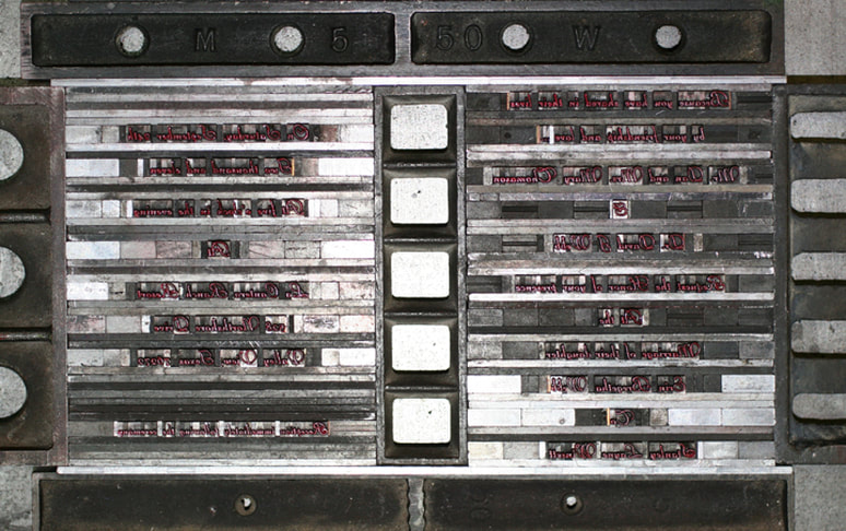
I have been a printmaker since 1998, and have been volunteering at the Museum of Printing History since my exhibition there in 2008. My first letterpress printing there was a poem by Shelley done in December 2010, and I was anxious to extend my experience at the art of text and foundry type. We consulted back and forth on the text of the invitation, the paper, and the font and after six weeks of communiques I was ready to set the form. We had picked Liberty Script, a fine font which the Museum had in abundance in 14 point and 12 point, the sizes I needed for a line length of 20 points. At 72 points per inch, a 20 point line is 3.6 inches. I set the type upside down with the nick up in a compositor's stick held in my left hand as I pulled the type from the case with my right hand. Thus, when the stick is turned upside down, the text reads backwards as it must for printing from lead font. Since the text was to be center justified, I placed an equal number of spacers of whatever sort I needed (quads, em-spaces, en-spaces, etc) on both sides of the text, then adjusted the tension with thins of 1 point (copper) or 2 points (brass) until the tension was just right before moving on to the next line.
When all the lines were set, I placed the form (the type to be printed) on the bed of the Vandercook press and placed furniture around the text, including horizontal and vertical quoins to tighten the text and prevent slippage during the printing process. I planed the letters by tapping with a rubber mallet to make sure no letter stuck up too high, checked that there was no lateral slack by pushing backwards and forwards, then tightened the quoins to secure the form on the press bed. I inked in red (Pantone 199) with a hand roller, and printed on Fabriano Medioevalis.
 RSS Feed
