I had been volunteering at the Museum of Printing History for more than a year, accumulating studio time to work on book arts projects. I was finally ready to to set my first type, and wanted to start with a modest project. A single page of text would he a good beginning, and a succinct and meaningful poem would be ideal. All the past fall I had I had been watching episodes of Inspector Morse and its successor, Inspector Lewis, on PBS Masterpiece Theater, as much for the wonderful poetry by A. E. Housman and others as for the drama of the series. The action takes place at Oxford University where multiple murders must be solved without disturbing the dreamy academics. In the episode "And the moonbeams kiss the Sea," Percy Bysshe Shelley's poem, Love's Philosophy is found in the pocket of a murdered art student. An early suspect is another artist with a quirky personality, perhaps somewhat autistic. He seems unaffected by the murder of his friend and lover, is amused that the police have found a "body in the Bodleian," the ancient library at Oxford holding manuscripts of English poets back to Shakespeare and Chaucer. Oxford is the university of my fantasies, and any drama set there is sure to charm me.
For weeks after seeing the episode my mind was full of the Romance of Shelley's life and early death, his passionate loves and committed atheism. The end of the episode finds Inspector Lewis at the Shelly Memorial on the Oxford campus marveling at the icy cool sculpture of the drowned Shelley by Edward Onslow Ford. My first project would be the love poem of Shelley's youth.
The first decision was to choose an appropriate font. I wanted it to be from the times when the poem was published in 1819, but that was not the only restriction. It also had to be present in three sizes: title, body text and present in the museum's collection in sufficient quantity to account for all the letters. The font called Baskerville was a classic early 19th century font that filled the historical requirements, and there was enough of the 11, 12 and 14 point foundry type letters to accommodate the poem.
The second decision was the choice of paper. A machine-made paper would not be distinguishable from a printout from a computer printer. I chose instead a handmade paper made of abaca fibers by the papermaker at the museum, Kathy Gurwell.The paper was a soft paper with a lot of individual variation, and was a lovely shade of beige. Every sheet bore a deckled edge, and the size of 8.5" x 11" left a generous amount of paper surrounding the poem.
The third choice was which press to use, one of the Kelsey platen presses, the Washington press, or the Vandercook proof press. The Kelsey is self-inking, so it would be faster to print a large number, but I only needed 25 copies and did not mind hand inking. The Washington is a little harder to register each sheet, and requires more muscular effort per sheet, so I chose the Vandercook. Each sheet is fed into the press with a rolling motion, so the work flow is smooth, and the hand inking would not be a chore for twenty five copies.
The fourth choice is ink, and the alternatives are rubber-based offset ink and oil based printing ink. Though rubber-based ink is slower to dry, it stores on the shelf longer for intermittent printers like myself. I normally use rubber-based ink for my linocut prints, so I stayed with that.
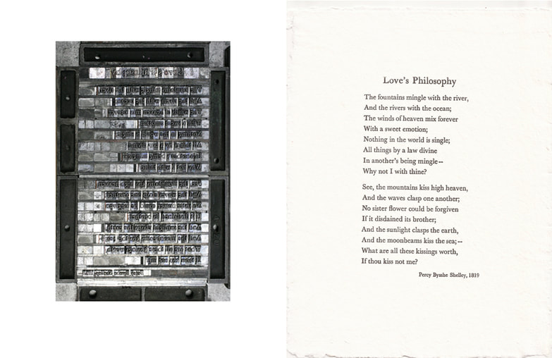
Foundry type is stored in drawers (cases) filed with a California case layout. I opened the case and with the compositor's stick in my left hand, placed the letters upside down (nick up) into the stick in the order of the text. After each line I checked the tension by adding thins, combinations of brass (2 points) or coppers (1 point) until the letters no longer had any slack nor were too rigid. Setting the entire poem was an afternoon's work. When the lines are turned right-side up, it reads backwards, as it must to print the correct direction.
The following day I arrived early with my paper, ink, roller and cleanup materials in hand. Printing was almost anti-climactic, and in just an hour or so I had all the copies I wanted. These went onto the drying rack, and when I returned the following day the copies were thoroughly dry, and I redistributed the type back into its proper cases.
For weeks after seeing the episode my mind was full of the Romance of Shelley's life and early death, his passionate loves and committed atheism. The end of the episode finds Inspector Lewis at the Shelly Memorial on the Oxford campus marveling at the icy cool sculpture of the drowned Shelley by Edward Onslow Ford. My first project would be the love poem of Shelley's youth.
The first decision was to choose an appropriate font. I wanted it to be from the times when the poem was published in 1819, but that was not the only restriction. It also had to be present in three sizes: title, body text and present in the museum's collection in sufficient quantity to account for all the letters. The font called Baskerville was a classic early 19th century font that filled the historical requirements, and there was enough of the 11, 12 and 14 point foundry type letters to accommodate the poem.
The second decision was the choice of paper. A machine-made paper would not be distinguishable from a printout from a computer printer. I chose instead a handmade paper made of abaca fibers by the papermaker at the museum, Kathy Gurwell.The paper was a soft paper with a lot of individual variation, and was a lovely shade of beige. Every sheet bore a deckled edge, and the size of 8.5" x 11" left a generous amount of paper surrounding the poem.
The third choice was which press to use, one of the Kelsey platen presses, the Washington press, or the Vandercook proof press. The Kelsey is self-inking, so it would be faster to print a large number, but I only needed 25 copies and did not mind hand inking. The Washington is a little harder to register each sheet, and requires more muscular effort per sheet, so I chose the Vandercook. Each sheet is fed into the press with a rolling motion, so the work flow is smooth, and the hand inking would not be a chore for twenty five copies.
The fourth choice is ink, and the alternatives are rubber-based offset ink and oil based printing ink. Though rubber-based ink is slower to dry, it stores on the shelf longer for intermittent printers like myself. I normally use rubber-based ink for my linocut prints, so I stayed with that.
Foundry type is stored in drawers (cases) filed with a California case layout. I opened the case and with the compositor's stick in my left hand, placed the letters upside down (nick up) into the stick in the order of the text. After each line I checked the tension by adding thins, combinations of brass (2 points) or coppers (1 point) until the letters no longer had any slack nor were too rigid. Setting the entire poem was an afternoon's work. When the lines are turned right-side up, it reads backwards, as it must to print the correct direction.
The following day I arrived early with my paper, ink, roller and cleanup materials in hand. Printing was almost anti-climactic, and in just an hour or so I had all the copies I wanted. These went onto the drying rack, and when I returned the following day the copies were thoroughly dry, and I redistributed the type back into its proper cases.
 RSS Feed
